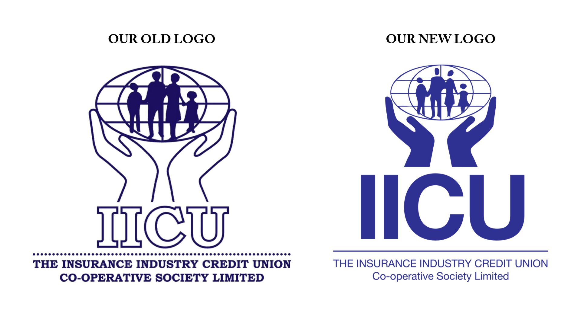
Over the past few weeks you may have noticed that all our content on social media contained a new logo. Today, we want to officially introduce you to our new logo and branding.

This new logo represents our drive to modernise our marketing strategies. We have created a permanent social media presence to better serve our membership. All our flyers have been revamped. Our website has undergone a major upgrade and is now mobile-responsive and more user-friendly with downloadable forms that can be filled on your PCs.
With all these changes, we saw it fit to give our logo a facelift. The icon remained the same as it represents who we are: a credit union that serves the financial needs of the entire family. However, we elected to change the font to a more sleek and modern sans-serif that echoes our forward-looking marketing strategy that is depicted on our website.
We have also updated our brand colour to a more vibrant shade of blue. This represents our warmth, compassion, and enthusiasm towards the future. It also shows our friendliness and our desire to treat each member as part of our family.

It’s the same name; the same credit union you know and trust. Only, we now have a sharper image with more of an impact.


LET'S KEEP IN TOUCH
Join our mailing list to receive the latest news, updates, and tips from the IICU team.
Thank You! You have been subscribed to our mailing list.